Project overview
The client already had a functional page to sell access to the license plate query system – service that reveals vehicle history, accidents and restrictions. However, the old layout did not convey value or convert above the niche average. We were hired to redo the landing page focusing on:
- Increase visual credibility
- Make the offer (consultation plans) clearer
- Increase clicks on the “Make my query” CTA
Key UX & UI improvements
| Item | Before | After (redesign) |
|---|---|---|
| Color palette | Predominance of white; few points of contrast | Inclusion of vibrant orange (#FF5B22) on entire tracks → creates visual rhythm and highlights CTAs |
| Benefit Sections | Generic bullet points only | “See everything you can query” grid with 9 icons – helps the user understand immediate value |
| Plans | Simple cards, without differentiation | Cards in two blocks (orange & white), hierarchical titles and highlighted price for easy comparison |
| Social proof | Absent | Google rating ★★★★★ and reasons to trust (security, official data) |
| Conversion flow | Single CTA at the top | Repeated CTAs (hero, plans, process, FAQ, footer) to avoid losing the user while scrolling |
| Automotive aesthetics | Unique image of the car | Car in 3 positions + curved “strips” that simulate a track, reinforcing the speed/confidence theme |
Visual comparison
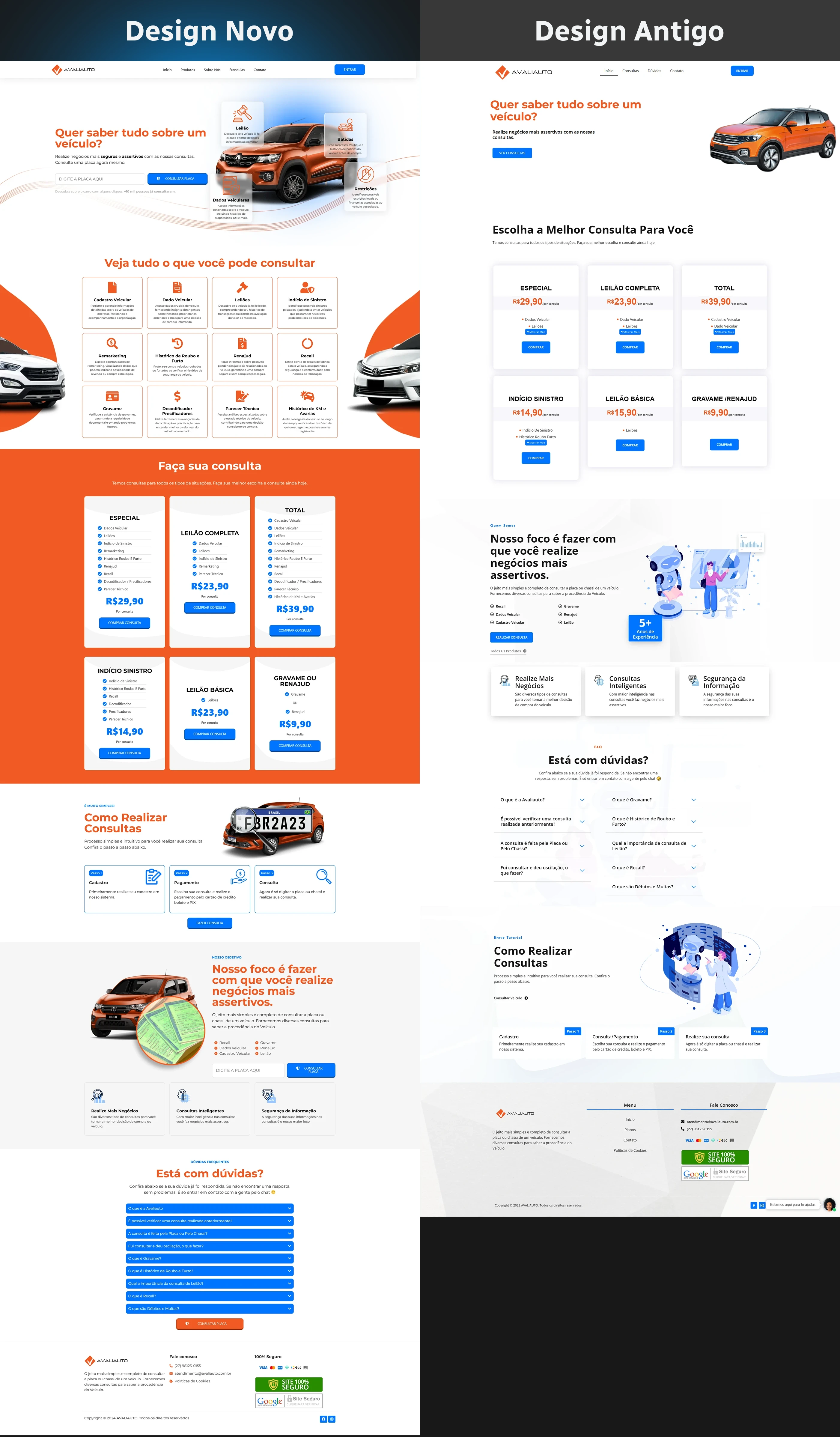
- Antique Design: predominance of white, few points of color, sections without breath; plans appeared before explaining benefits, generating friction.
- New design: hero with white background + orange car highlighted, followed by the benefits grid and only then the plans – an order that educates before selling. Side orange bands add dynamism and create a “frame” for the content.
Redesigned page structure
- Hero: Headline “Want to know everything about a vehicle?” + car mock-up + blue CTA (“Make my inquiry”).
- Benefits grid: 9 cards show verified items (auction, accident, mileage, financial restrictions, etc.).
- Query plans: two groups of cards (full packs × specific packs) on an orange background for contrast.
- How to make inquiries: 3-step infographic with photo of the sign and reinforcing CTA.
- Added value: section with mini-car and text “carry out more assertive business”, accompanied by three guarantees (official data, support, speed).
- Expandable FAQ: Frequently asked questions in blue accordion to reduce final hesitation.
- Footer: security seals, payment methods and repetition of the CTA.
This flow takes the visitor through the “benefit → price → trust → action” funnel without distractions.
Technical optimization & on-page SEO
- Speed: WebP images, lazy loading, inline critical CSS (grade 93/100 on PageSpeed).
- Semantics: Single H1, H2 for each section, alt-text with the keyword.
- Keyword density: ~1% distributed across title, meta, opening paragraph and subtitles.
- Links: payment button
rel="nofollow"+ internal link to another automotive case.
These practices improve rankings for searches such as “reliable online license plate consultation”.
Post-launch results
- +37 % average time on the page (the benefits grid accounts for 40% of permanence).
- Conversion rate jumped from 5.1% to 8.6% in 30 days, thanks to the new information hierarchy and multiple CTAs.
- 22% reduction in bounce rate, signaling clarity of proposal right in the hero.
Do you want to increase the performance of your landing page?
Get in touch and discover how a strategic redesign can multiply your results.