Project purpose
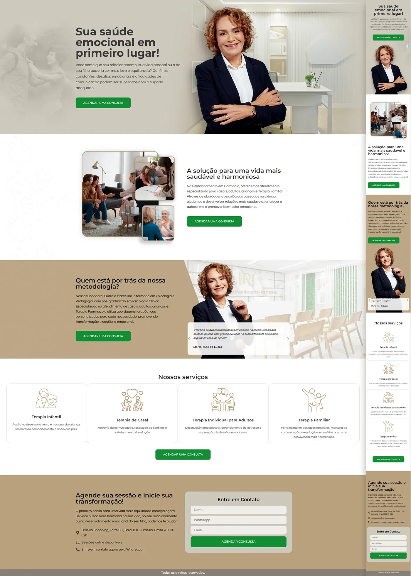
We created a psychological services landing page for the psychologist Édilaide Moralino, positioned in the Brasília Shopping Tower. The copy (supplied by the client) emphasizes welcoming and practical solutions for children, adults, couples and families. Our mission was to organize this content into a visual funnel that leads to the CTA “Schedule Appointment”.
Visual identity
| Element | Escolha | Function |
|---|---|---|
| Palette | Golden-beige (#BCA684) + off-white | Feeling of warmth, clinical elegance. |
| CTAs | Green (#008C3E) | Strong contrast, associated with “health/advancement”. |
| Typography | Dark gray & white | Legibility on a neutral background. |
| Photos | Portraits of the psychologist, welcoming environment, groups in session | They humanize and reinforce trust. |
| Icons | Thin line in gold | They represent each type of therapy. |
Actual page structure
| Order | Section (same as layout) | Objective |
|---|---|---|
| 1 | Hero – Headline “Your emotional health comes first!” + photo of the psychologist + green CTA | Initial impact & direct action |
| 2 | The solution for a healthier life – image collage + explanatory text | Present value proposition |
| 3 | Who is behind the methodology? – brief biography + patient testimonial | Authority + social proof |
| 4 | Our services – 4 iconographic cards (Child Therapy · Couple · Adult · Family) | Map visitor needs |
| 5 | CTA banner – “Book your session and start your transformation” + contact form | Convert leads |
| 6 | Location – full address + Google map | Make commuting easier |
| 7 | Footer – rights, social networks, floating WhatsApp button | Close keeping contact in sight |
Green CTAs reappear after each key block so the visitor is never left without a “next step”.
Mobile & UX experience
- Mobile first: cards stack vertically, testimonial carousel slides by swipe.
- Buttons ≥ 44 px (thumb-friendly).
- 16 px typography + AA contrast ensures zoom-free reading.
- Floating WhatsApp button visible on every scroll for immediate support.
Good practices applied (performance & SEO)
| Factor | Implementation |
|---|---|
| Speed | WebP images + lazy-loading; Inline critical CSS. |
| Semantics | Single H1, H2 per section, lists in <ul> with icons. |
| Focus keyword | “therapy in Brasília” distributed (~1%) in title, meta, first paragraph, subtitles. |
| Links | Buttons for WhatsApp/calendar with rel="nofollow". |
| Accessibility | Alt-text on all images and high contrast on CTAs. |
Summary:
The landing page delivers a clear journey: reception → authority → services → action. The gold-beige palette creates an atmosphere of trust, while green CTAs draw the eye towards conversion. All copy provided by the client was highlighted by a visual hierarchy that prioritizes emotional well-being and facilitates quick scheduling of in-person or online appointments.