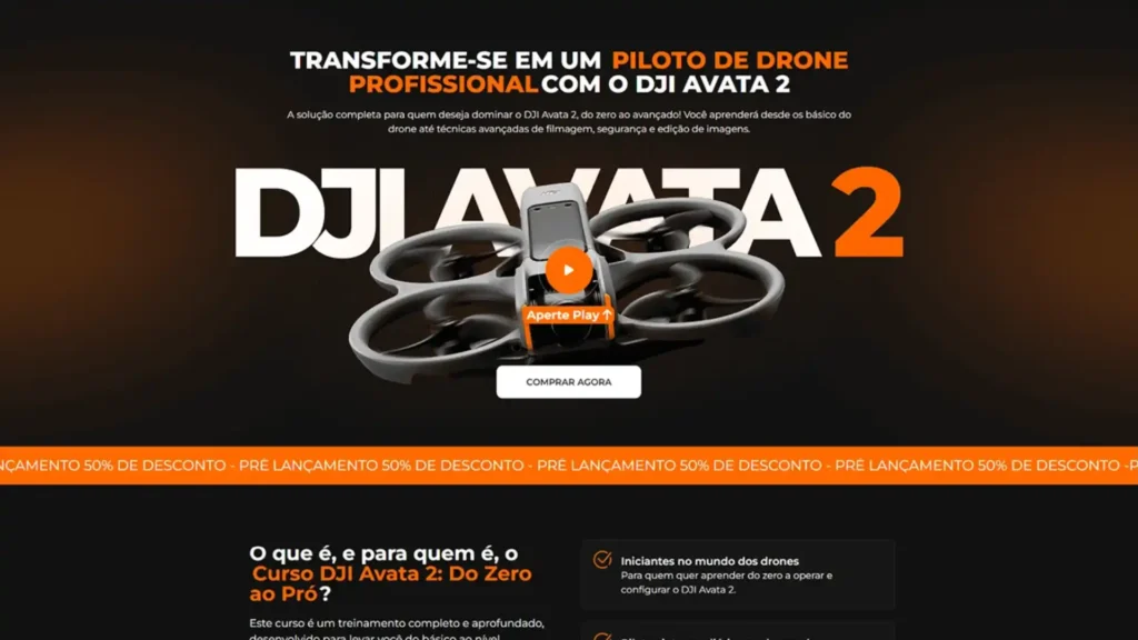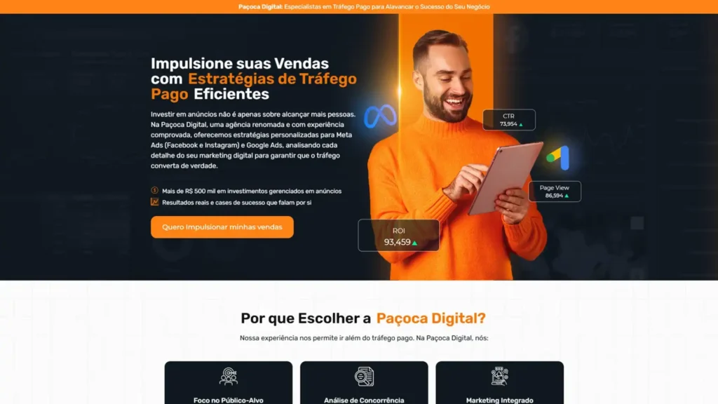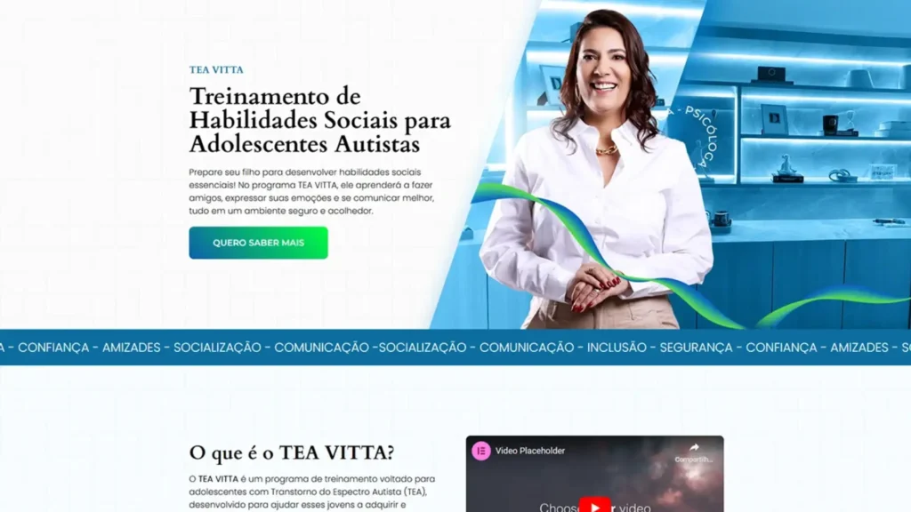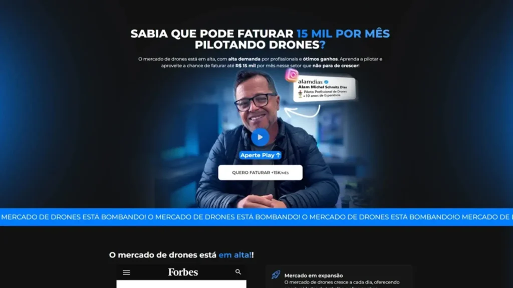
Project objective
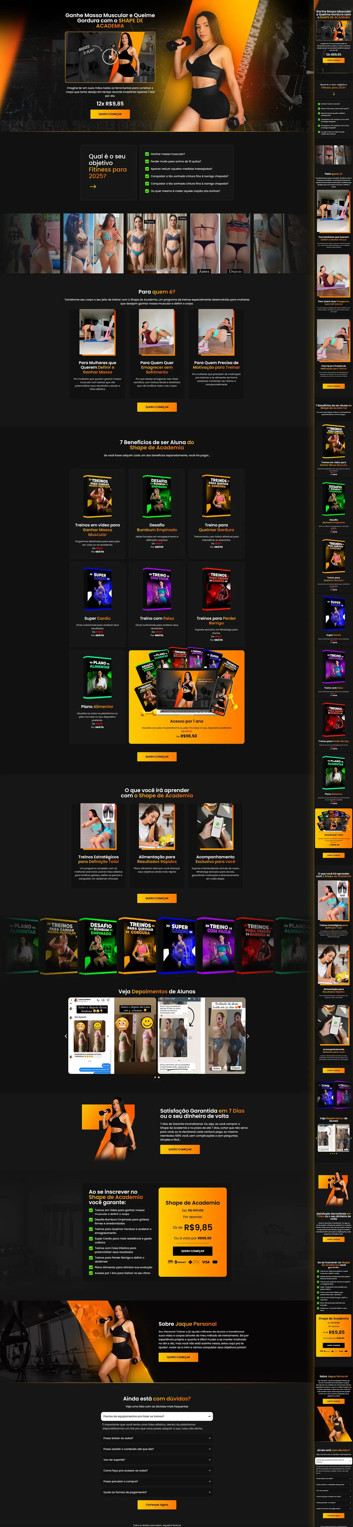
We develop the Landing Page online female training “Shape de Academia” to sell a fitness training package at a popular price. The copy was provided by the client (coach Jack Personal) — our task was to organize the text into a visual funnel that leads to the CTA “I want to start”.
Visual identity
| Element | Escolha | Function |
|---|---|---|
| Background | Textured black | Reminds the gym, highlights neon elements. |
| Highlight Palette | Fire orange gradient (#FF7A00 → #FFB400) | Energy, immediate action. |
| CTAs | Solid orange buttons with white text | They direct to look at conversion. |
| Icons/Checks | Neon Green (#00D952) | List benefits and guarantees. |
| Typography | White + light gray | Legibility on a dark background. |
| Photos | Images of Jaque (sports look) + before/after of students | Authority and social proof. |
Page flow and sections
| Block | Content | Purpose |
|---|---|---|
| Hero | Teaser video + headline “Gain Muscle Mass and Burn Fat…” + installment payment 12× R$ 9.85 | Initial impact & attractive price |
| Fitness Goal | Visual quiz (green checklist) to engage visitors | Audience self-identification |
| Results gallery | Slideshow with photos of students before/after | Visual social proof |
| Who is it for | 3 cards (Women without time, Who wants to define, Postpartum) | Clear targeting |
| 7 Benefits of being a Student | Carousel with e-books/workouts (Gain, Challenge, HIIT, etc.) | Show package value |
| What will you learn | 3 cards (Intensified training, Practical nutrition, Follow-up) | Detail method |
| Testimonials | Prints from WhatsApp/Instagram ★★★★★ | Credibility |
| 7 Day Guarantee | Orange block + “money back” stamp | Reduces risk |
| Offer | Checklist of what you receive + box price R$ 9.85 | Convert |
| About the coach | Photo + mini-bio of Jaque Personal | Authority |
| FAQ | 5 questions (time, equipment, support…) | Break down objections |
| Footer | Final CTA + rights | Close keeping action visible |
Orange CTAs appear after each decisive section, ensuring the user never misses the “next step”.
Mobile & UX experience
- Mobile first: carousels slide by swipe; Cards stack vertically.
- Buttons ≥ 44 px tall, easy to tap.
- Typography 16 px; AA contrast ensures reading without zooming.
- WhatsApp button floats in the bottom right corner for immediate support.
Good practices applied (performance & SEO)
| Factor | Implementation |
|---|---|
| Speed | WebP images + lazy-loading; Inline critical CSS. |
| Semantics | H1 single, H2 for each section; lists in <ul> with icons. |
| Focus keyword | “home training to gain mass” distributed (~1%) in title, goal, intro, subtitles. |
| Links | Checkout buttons marked rel="nofollow"; internal link to fitness blog. |
| Accessibility | Descriptive alt-text on all images and high contrast on CTAs. |
Summary:
The landing page Gym Shape fuses “neon gym” aesthetics, tangible benefits and strong social proof. The route — promise → segmentation → value → guarantee → offer — supports a clear and repeated sales pitch in orange CTAs, driving conversions for coach Jaque’s online training program.