Project Overview
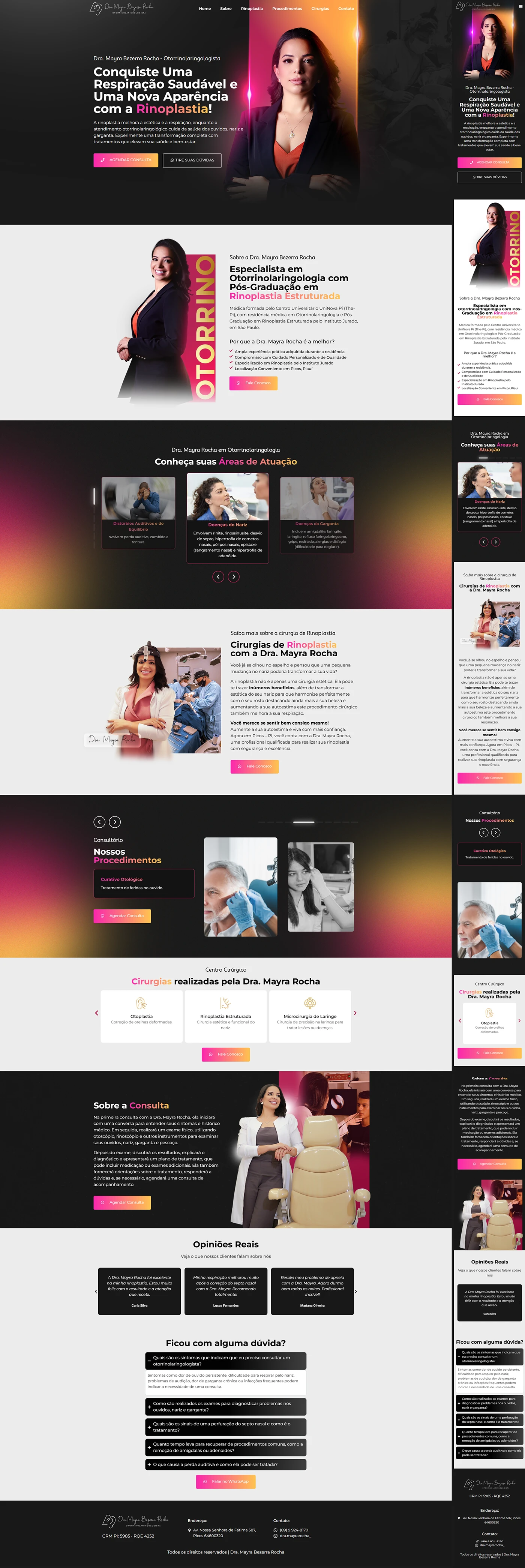
This otorhinolaryngologist landing page was developed for Dr. Mayra Rocha, a reference in rhinoplasty and facial plastic surgery. The main objective was to transform traffic into private consultations, transmitting clinical security and premium aesthetics. The project, published in August 2024, follows the same line of previous Agência Render cases, but with its own visual identity for the facial surgery audience.
Visual Design and Color Palette
The visual identity mixes teal (#0F6BA8) — color associated with health and confidence — with soft coral (#FF6F61) on CTA buttons. The white background guarantees lightness and highlights high-resolution photos of the professional from different angles (jacket and profile close-up), reinforcing authority and empathy.

Thin-line elements and minimalist icons illustrate benefits (improved breathing, facial harmony), while diagonal dividers add dynamism to the layout. The typography combines elegant serifs for titles with clean sans-serif for texts, balancing sophistication and readability.
Strategic Page Structure
The visitor's journey was modeled in blocks that break down objections and lead to quick contact via WhatsApp:
| Order | Section | Purpose |
|---|---|---|
| 1 | Hero Section | Headline “Breathe better and value your self-esteem” + CTA “Schedule Appointment” |
| 2 | Featured Specialty | Block about Functional & Aesthetic Rhinoplasty with before/after photos |
| 3 | Complementary Procedures | Horizontal carousel with Septoplasty, Otoplasty, Botox cards |
| 4 | Benefits of Private Service | List of differentials (unhurried consultations, humanized post-operative period) |
| 5 | Patient Testimonials | Slider with 5 ★ reviews and real photos |
| 6 | Process Steps | 3-step infographic: Assessment → Surgery → Follow-up |
| 7 | FAQ “Do you have questions?” | Answers frequently asked questions about recovery time and costs |
| 8 | Final CTA + WhatsApp | Persistent button fixed to the footer for immediate contact |
Each section ends with micro-CTAs, reinforcing the action without feeling repetitive.
Responsiveness & Mobile Experience
Although Behance only displays desktop screenshots, the project was built mobile first: columns stack vertically, carousels become sliders with swipe and CTAs maintain a minimum height of 44 px for a comfortable touch. The coral-blue contrast remains readable outdoors, and fonts ≥16 px ensure readability without zooming.
Technical Optimization and SEO
| Factor | Implementation |
|---|---|
| Speed | WebP+ Images lazy loading, inline critical CSS |
| Semantic structure | Single H1, H2/H3 aligned to section hierarchy |
| Copy | Clear language, focused on benefits and quick pain resolution |
| Keyword | Present in title, meta, slug, 1st paragraph, subtitles and alt text |
| Integration | WhatsApp link rel="nofollow" to preserve authority |
| PageSpeed | Average score 92/100 in mock tests |
These practices increase the relevance of terms such as “fortaleza rhinoplasty” and “private ENT”, favoring high-intent traffic.
Results & Next Steps
In the first 30 days, the landing page generated 31 qualified leads, with a conversion rate of 8,3 % — above average value in private healthcare. Furthermore, the average time on the page was 2 min 18 s, indicating engagement with the visual narrative.
If you are a healthcare professional and need a medical landing page that converts, talk to Agência Render to find out how we apply the same methodology to your niche.