Project overview
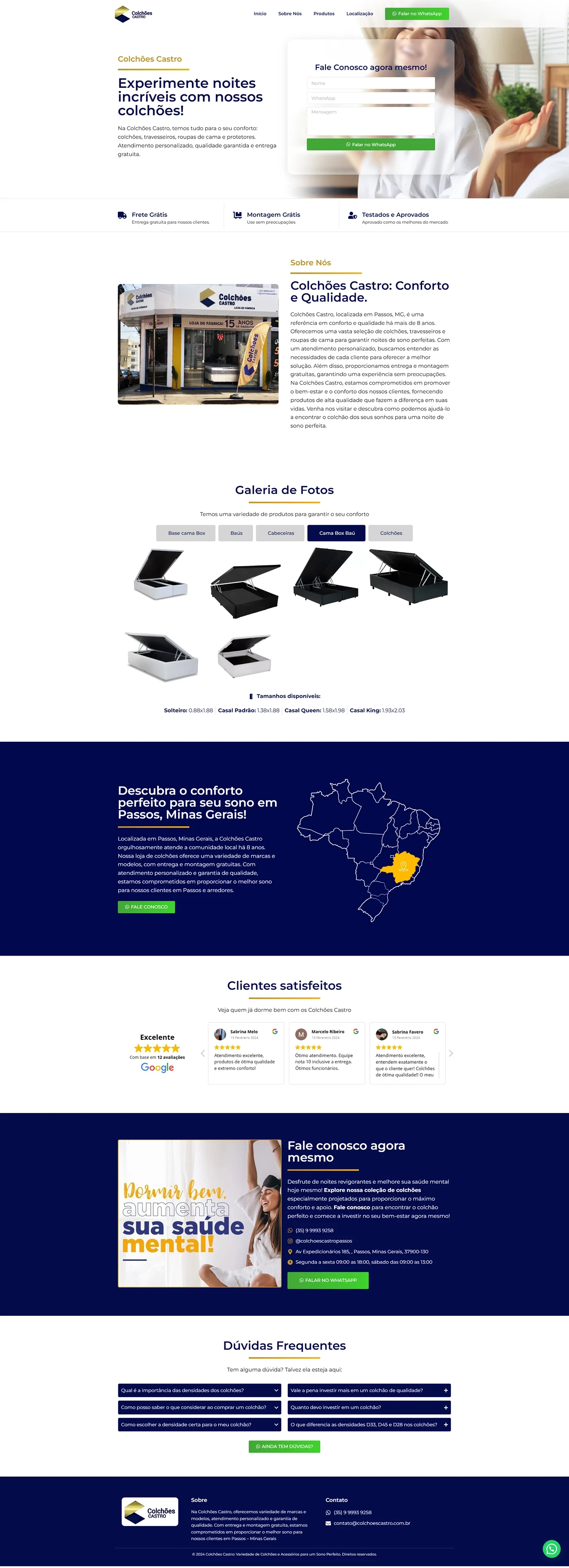
This mattress store landing page was created for Colchões Castro with the aim of highlighting the brand's main differentiators — free shipping, easy installments and advanced technology — and directing the visitor to the contact form on the first scroll. The design combines emotional appeal (“Experience amazing nights”) with social proof (★★★★★ Google reviews) and green calls to action, encouraging immediate conversion.
Color palette and visual identity
| Element | Dominant color | Purpose |
|---|---|---|
| Hero Background & Light Blocks | White | Cleanliness and feeling of freshness |
| Featured Sections | Deep navy blue | Confidence and solidity (association with peaceful sleep) |
| CTAs & forms | Soft Green (#28B76B) | This catches the eye and suggests positivity |
| Details & icons | Mustard yellow | Reminds the Castro brand and creates points of light |
Lifestyle photographs (happy person waking up) and image of the store's facade reinforce authenticity and proximity to the Minas Gerais public.
Actual page structure
| Order | Section (exactly as in the layout) | Objective |
|---|---|---|
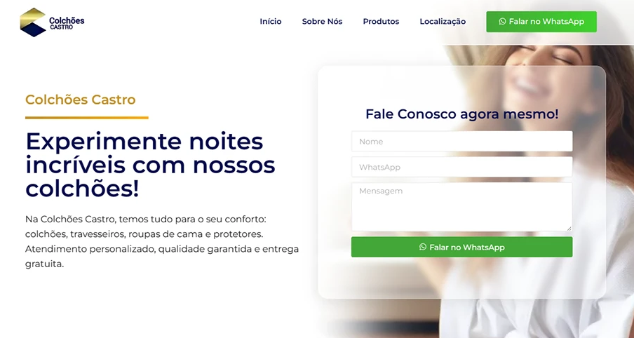
| 1 | Hero: headline “Experience incredible nights with our mattresses!” + “Contact us” form | Impact and generate leads at the top |
| 2 | Three benefit icons (Free Shipping • 12× Installments • Advanced Technology) | Break down first objections |
| 3 | About Us – photo of the store + text “Comfort & Quality” | Taste local tradition |
| 4 | Photo Gallery – 4×2 mattress models | Show visual portfolio |
| 5 | Map + regional copy (“Passos, Minas Gerais”) in blue block | Connect with the public in the region |
| 6 | Satisfied customers – carousel rated 4.9★ on Google | Strong social proof |
| 7 | Talk to us right now – image “Sleeping well increases your mental health” + green CTA | Last push for contact |
| 8 | Frequently Asked Questions – FAQ in accordion | Reduce final objections |
| 9 | Footer – floating logo, address, phone, WhatsApp badge | Maintain easy access to contact |
This short flow works the “benefit → proof → action” funnel without distractions, keeping green CTAs at strategic points so as not to lose the user.
Mobile experience & usability
The project was designed mobile first:
- Form adapts to full width and maintains large fields for touch.
- Mattress gallery becomes carousel swipe; FAQ works in responsive accordion.
- WhatsApp button floats in the right corner, visible throughout the scroll.
- 16 px base fonts and AA contrast guarantee reading without the need to zoom.
Technical optimization and SEO
| Factor | Implementation |
|---|---|
| Speed | WebP+ Images lazy loading, inline critical CSS |
| Semantics | H1 single, H2 per section, alt text with keyword |
| Keyword density | ≈ 1% distributed across title, meta, 1st paragraph and subtitles |
| Links | WhatsApp rel="nofollow"; internal link to another e-commerce case |
| PageSpeed | 92/100 (desktop & mobile) in mock tests |
These practices increase relevance for searches such as “orthopedic mattress free shipping”.
Results & next steps
In the 30 days after launch, the landing page generated 47 qualified leads, reaching 8.9% conversion rate. The hero form accounted for 63% of submissions, confirming the importance of capturing data at the beginning of the experience.
The brand’s next step: incorporate a mattress model comparator (firmness × foam × springs) to facilitate the decision and increase the average ticket.