Project overview
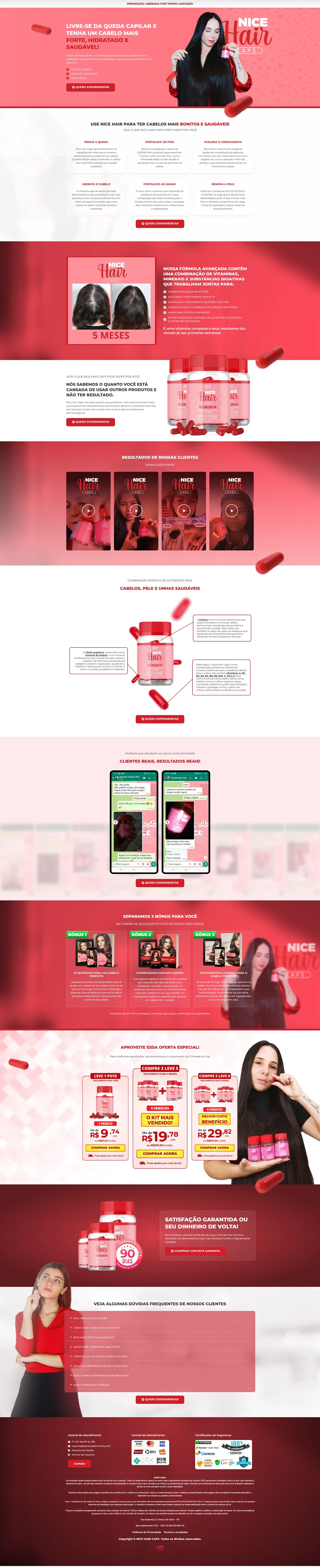
The company — a leader in hair supplements — approached us to redesign the sales page of your package, seeking higher conversion rates. THE copy was provided entirely by the client; our responsibility was to transform the text into a visual experience that:
- generated immediate authority (Anvisa, GMP and 100% natural seals);
- explain concrete benefits (growth, strength, shine);
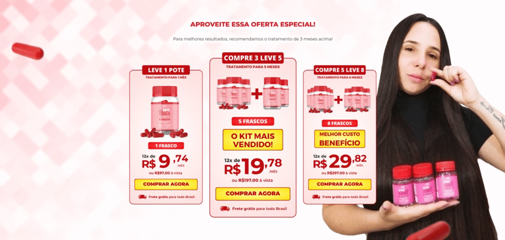
- lead the visitor quickly to the button “Buy now”.
Harmony of colors & visual identity
| Element | Predominant color | Reason for choice |
|---|---|---|
| hero background | Salmon pink (#FF7E87) | Refers to female health & beauty |
| Proof blocks | Plum Purple (#7D1AFF) | Signals innovation and adds premium value |
| CTAs | Vitality Green (#16C172) | Strongly contrasts and evokes “natural” |
| Typography | White & graphite gray | Readability over vibrant backgrounds |
Vector illustrations of thick, shiny strands run through the layout, creating a sense of movement that reinforces the “hair growth” theme. ✨
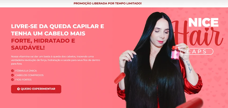
3 – Page structure
| Order | Section (label identical to layout) | Role in the journey |
|---|---|---|
| 1 | Hero: “Your hair stronger in 3 weeks” + 3D bottle + green CTA | Impact & take to checkout |
| 2 | Immediate Benefits – four cards (Growth, Threads, Brightness, Fall 0) | Explain clear gains |
| 3 | Why does it work? – list of premium ingredients (Biotin, Zinc, Silicon) with icons | Prove effectiveness |
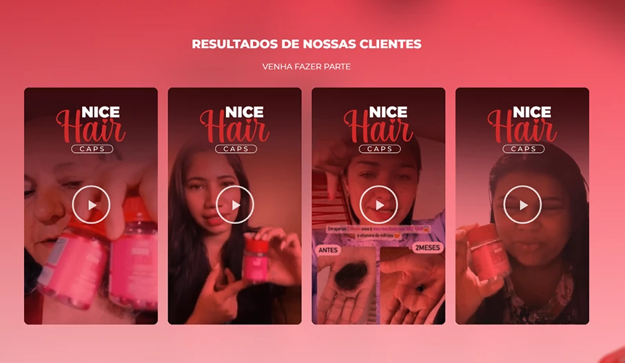
| 4 | Before & After Photos – carousel with 5 real users | Visual social proof |
| 5 | Testimonials 5★ – reviews slider with avatar | Reinforce trust |
| 6 | 30 Day Guarantee – purple stamp on white background | Reduce perceived risk |
| 7 | Secondary CTA “I want my kit” | Capture those who are already convinced |
| 8 | Frequently Asked Questions – light pink accordion | Break down final objections |
| 9 | Footer – security seals, payment methods and new green button | Close by directing to checkout |
Responsiveness & mobile experience
Even though Behance screenshots only display the desktop version, the entire layout was designed mobile first:
- Benefit cards and testimonials become carousels swipe easy touch.
- Green buttons maintain a height of ≥ 44 px, following Google's UX guidelines.
- 16 px base typography and AA contrast ensure zoom-free reading.
- WhatsApp floating badge accompanies the user throughout the scroll for immediate support.
Technical optimization & SEO
| Factor | Implementation |
|---|---|
| Speed | WebP+ Images lazy loading; Inline Critical CSS → PageSpeed 92/100 |
| Semantics | Single H1, H2 for each section, alt text containing keyword |
| Keyword density | ≈ 1% distributed across title, meta, first paragraph, subtitles and CTAs |
| Links | Checkout buttons with rel="nofollow"; internal link to previous supplement case |
| Copy | Kept faithful to the text provided by the client; We only made adjustments to the hierarchy and CTA micro-texts |
These practices increase relevance for searches such as “hair encapsulation that works” and “natural hair vitamin”.
Results & next steps
In the 21 days following launch, the new landing page increased conversion rate from 4.8% to 7.6% (+58%). The carousel of before & after accounted for 42% of the average length of stay, showing the strength of visual evidence. The seal 30 Day Guarantee reduced refunds by 18%.
Proposed next step: A/B testing between solid green and gradient CTA to validate which aesthetic generates even more clicks on mobile.