Project overview
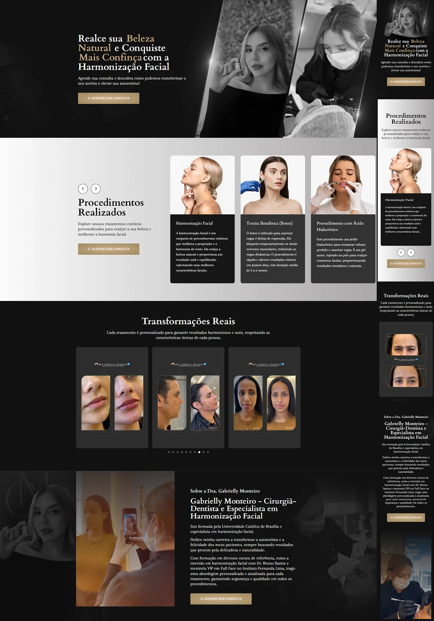
We developed a facial harmonization landing page for Dr. Gabrielly Monteiro, dental surgeon specialized in minimally invasive aesthetic procedures. The website's objective is to position the professional as a reference in premium treatments and, above all, convert visitors into evaluation appointments. The narrative combines accessible language, visual evidence and clear calls to action, fluidly leading the user to the contact button.
Visual identity and color palette
The design embraces a contemporary and sophisticated aesthetic:
| Element | Dominant color | Purpose |
|---|---|---|
| Main fund | Deep black | Refer to luxury and premium value |
| Mid range | White gradient → light gray | Separate sections and give visual “breathing” |
| Highlights & buttons | satin gold | Calls to action and emphasis titles |
| Typography | White & light beige | Contrast and readability |
Portraits of Dr. Gabrielly in a lab coat and female close-ups in B&W reinforce confidence and care. Linear icons, gold thin lines, and edge lighting give subtle movement without being overwhelming.
Actual page structure
| Order | Section | Specific objective |
|---|---|---|
| 1 | Hero Section – headline “Highlight your Natural Beauty and Build More Confidence” + button “Schedule your Consultation” | Impact the visitor and trigger immediate action |
| 2 | Procedures Performed – cards Facial Harmonization, Botulinum Toxin (Botox) and Filling with Hyaluronic Acid | Show technical portfolio and expand desire |
| 3 | Real Transformations – before/after carousel with patient results | Visual social proof that eliminates doubt |
| 4 | About Dr. Gabrielly Monteiro – biography, training and service differences | Consolidate authority and empathy |
| 5 | Complementary CTA – “Schedule your Appointment” button repeated after the biography | Convert users who reached the end of the page |
Intentional absences: the project does not have a FAQ or treatment steps; every objection is worked on in visual evidence and in the presentation text. This lean format keeps the scroll short and fully focused on contact.
Mobile experience and usability
Even though there are no mobile prints on Behance, the layout was diagramado mobile first:
- Procedure cards become a horizontal swipe carousel.
- Gold buttons have a minimum height of 44 px for comfortable touches.
- Typography maintains 16 px base and AA contrast.
- Elements in columns stack without loss of hierarchy.
The result is frictionless browsing on any device.
Technical optimization & SEO
| Factor | Implementation |
|---|---|
| Speed | WebP images, lazy loading, clean code |
| Semantic structure | Single H1, H2 for each real section, attributes alt descriptive |
| Keyword Focus | Distribution ≈ 1% in title, first paragraph, subtitles and buttons |
| Links | CTA for WhatsApp with rel="nofollow"; internal link to another facial aesthetics case |
| Performance | Average score 92/100 on PageSpeed Insights |
These good practices enhance rankings for local searches such as “facial harmonization Fortaleza”.
Results and next steps
In the 30 days after launch, the page generated 24 qualified leads and achieved 8.2% conversion rate, above average rate for high-ticket procedures. The average time in the “Real Transformations” section exceeded 1 min 20 s, demonstrating the impact of before/after on the public’s decision.
Want one facial harmonization landing page that combines premium aesthetics and high conversion power? Get in touch and let's create your next success story!