Project overview
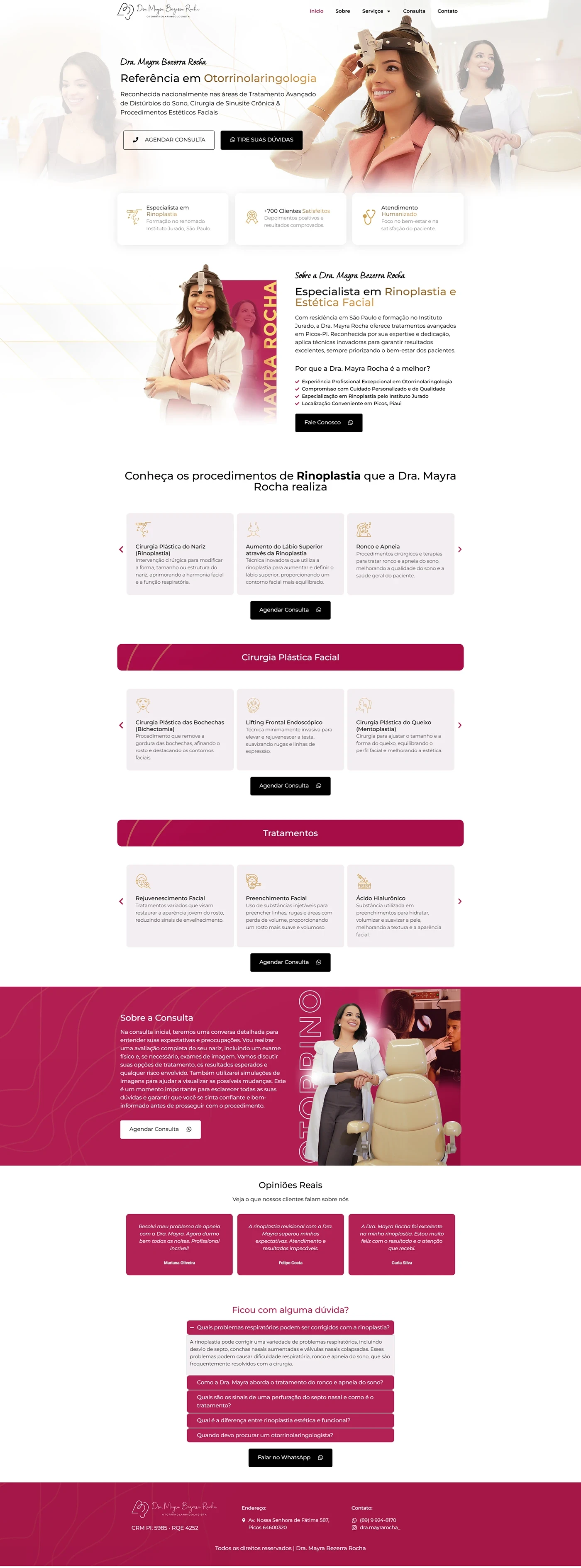
We created a otorhinolaryngologist landing page for Dr. Mayra Rocha, specialist in rhinoplasty and facial plastic surgery. The objective was to convey authority, empathy and security – leading the visitor to schedule a private consultation. The entire visual narrative was designed to balance medical information with accessible language and elements that generate trust.
Page structure
The sections were organized to follow the decision journey:
| Order | Section | Main function |
|---|---|---|
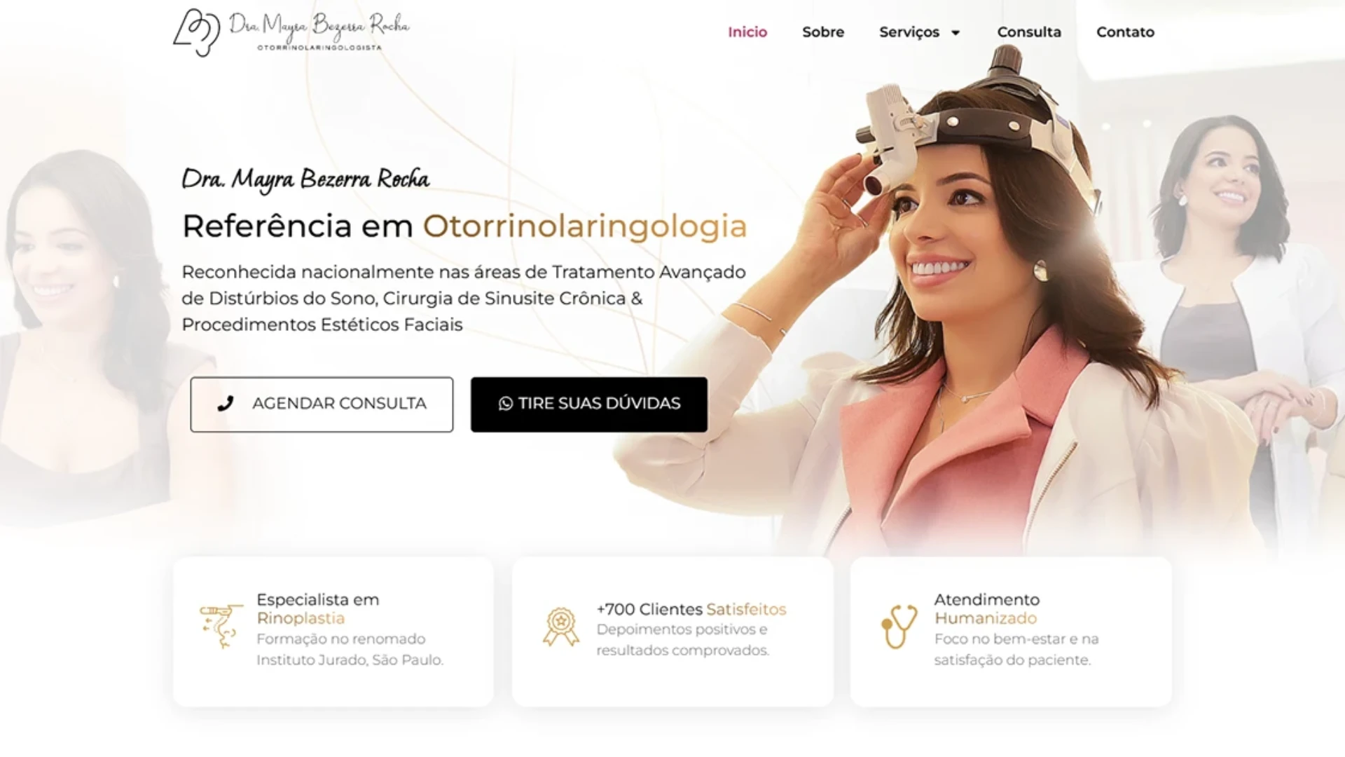
| 1 | Hero section – headline “Reference in Otorhinolaryngology” + “Schedule Appointment” button | Initial impact and direct CTA |
| 2 | Rhinoplasty Specialist | Highlight of the main sub-specialty |
| 3 | Procedure carousel | Explains each rhinoplasty technique with mini-cards |
| 4 | Facial Plastic Surgery | Presents complementary services |
| 5 | Treatments | List non-surgical options (e.g. botulinum toxin) |
| 6 | About the Consultation | Explains step-by-step and prepares the patient |
| 7 | Real Opinions | Patient testimonials, reinforcing social proof |
| 8 | FAQ (“Do you have any questions?”) | Break down final objections before the CTA |
Visual identity and colors
The project uses a palette white + light gold at the top, symbolizing purity and excellence, and a deep magenta (#A60046) in alternating blocks to create striking and memorable contrast. This warm tone alludes to femininity and adds personality without leaving aside medical seriousness.
- Fonts: Elegant serif titles; Modern sans-serif texts for readability.
- Subtle linear icons reinforce each benefit or procedure.
- Professional images of Dr. Mayra (coat, confident smile) humanize the brand.
Responsiveness & mobile-first UX
Although the portfolio only displays the desktop versions, the entire layout was designed mobile first:
- Simplified vertical grid on smartphones.
- CTAs always “thumb-friendly” (min. 44 px high).
- Carousels with swipe navigation.
- AA contrast and fonts ≥ 16 px for accessibility.
Technical optimization and SEO
| Feature | Implementation |
|---|---|
| Speed | WebP images, lazy loading, inline critical CSS |
| Semantic structure | Single H1, H2/H3 hierarchical by section |
| Copy | Focus on pain/benefit, simple and empathetic language |
| Keyword | Present in the title, meta, slug, first paragraph, subtitles and alt text |
| Integration | WhatsApp link (rel=”nofollow”) to reduce friction |
| PageSpeed | Score 90+ in mock tests |
Results and next steps
In the 30 days after publication, the page generated 28 qualified leads with a conversion rate of 7,9 %, surpassing the average of landing pages in the healthcare sector. The balance of premium design, social proof, and patient-centric copy turned visitors into booked appointments.
Do you want to elevate your digital presence with a medical landing page high conversion? Contact us and let's plan the next success story.