Project overview
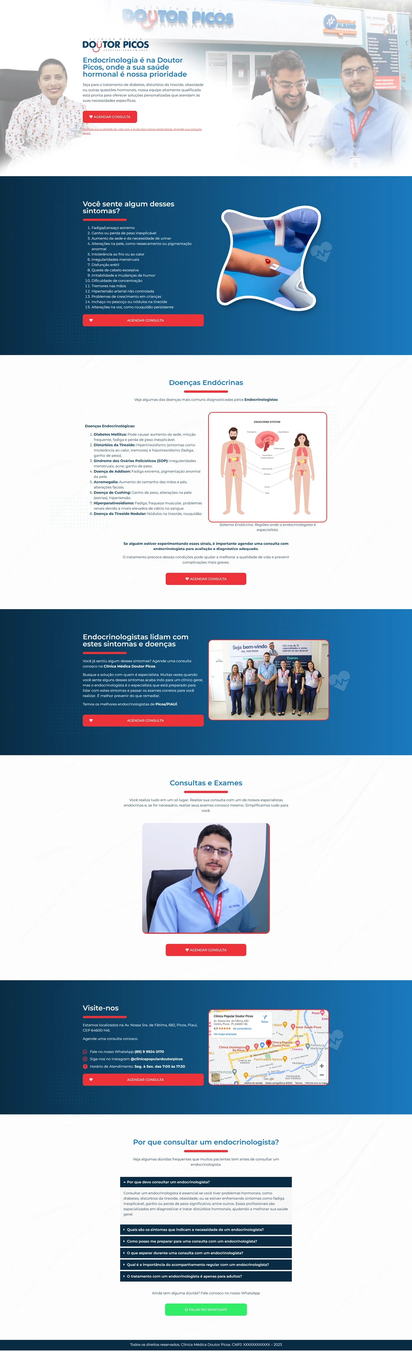
We developed a landing page endocrinologist medical clinic for the team Doctor Picos, whose focus is the diagnosis and treatment of endocrine diseases. The objective was to convey confidence, educate about symptoms and facilitate immediate scheduling of private consultations via WhatsApp and telephone.
Harmony of colors and visual identity
| Element | Dominant color | Purpose |
|---|---|---|
| Hero background & gradients | Royal blue → cyan | Associate health, science and credibility |
| CTAs | Bright red (#D21B1B) | Immediate click attraction (“Schedule appointment”) |
| Main text | White | Contrast and readability over blue |
| Clinical sections | Clean white | Breathe visually and focus on content |
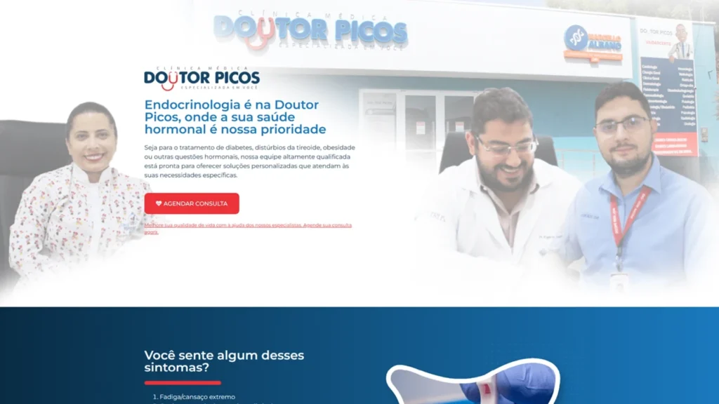
The original photos – doctors smiling in the hero, team gathered and close-up of the specialist – humanize the brand and reinforce authority.
3 – Actual page structure
| Order | Layout section | Objective |
|---|---|---|
| 1 | Hero – Headline with specialty + photo of doctors + red CTA | Initial impact and direct action |
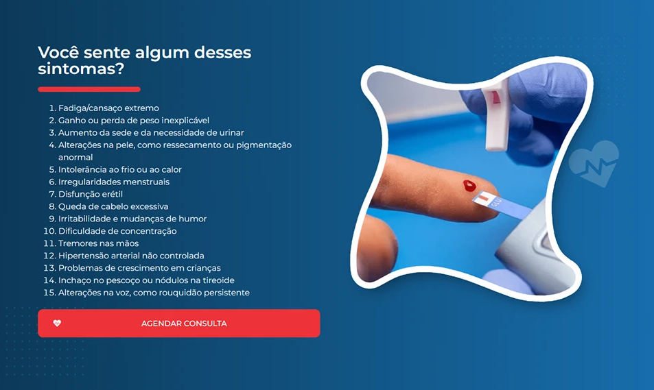
| 2 | “Do you experience any of these symptoms?” – list of signs + illustration of the thyroid | Generate identification with the visitor |
| 3 | Endocrine Diseases – detailed list + image of the human endocrine system | Educate and legitimize the need for consultation |
| 4 | “Endocrinologists deal with…” – dark blue section + full team photo | Proof of institutional know-how |
| 5 | Consultations & Exams – portrait of the main doctor + CTA | Explain service differences |
| 6 | Visit us – address, Google map and quick contacts | Facilitate movement and contact |
| 7 | Why consult an endocrinologist? – textual FAQ block | Break down final objections and remember benefit |
| 8 | Footer – legal data and new call to action | Close while focusing on conversion |
The sequence keeps the user engaged: problem → education → authority → action.
Mobile experience and usability
Although Behance only displays desktop screenshots, the landing page was built mobile first. The blue gradients transform into vertical blocks that are easy to scroll, the red CTAs maintain a minimum height of 44 px and the information carousels become compact lists that respect the appropriate spacing for taps. All base text remains at 16 px, ensuring zoom-free reading.
Technical optimization and SEO
| Factor | Implementation |
|---|---|
| Speed | WebP+ Images lazy loading, inline critical CSS |
| Semantics | Exclusive H1, H2 for each section, descriptive alt-text in figures |
| Keyword | Present in the title, meta, slug, 1st paragraph, subtitles and CTAs (≈ 1% density) |
| Links | WhatsApp button with rel="nofollow"; internal link to other medical cases |
| Performance | Average score 91/100 on Google PageSpeed |
With this, the page positions itself for searches such as “private endocrinologist in Picos” and “endocrine diseases treatment”.
Results & next steps
In the 30 days after launch, the landing page captured 33 qualified leads via WhatsApp, with 8.4% conversion rate. The block “Do you experience any of these symptoms?” retained the longest reading time, showing that educational content combined with visible CTA drives visitors to action.
Need a medical clinic sales page that combines professional design and real conversion? Get in touch and find out how we can apply the same strategy to your practice.