Project overview
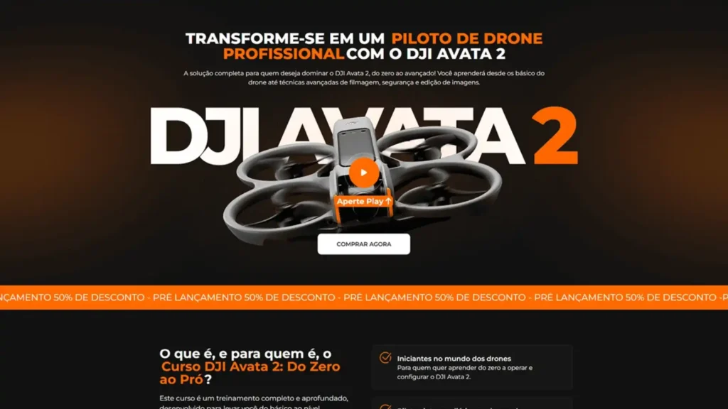
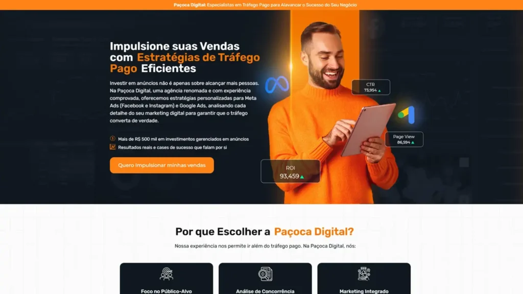
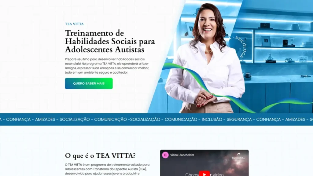
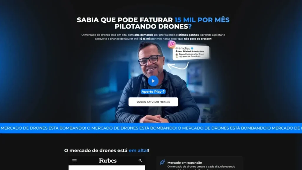
This landing page infoproducts was created to promote a package with 20 digital products, offering proprietary checkout, affiliate dashboard, and advanced upselling features. The objective was to present, in a clear and persuasive way, all the advantages of the platform and lead the visitor to the purchase button. The narrative combines objective language, visual evidence and calls to action repeated at strategic points.
Visual identity and color palette
| Element | Dominant color | Purpose |
|---|---|---|
| Main Backgrounds | Vibrant Purple (#661DFF) | Modernity and technology |
| CTAs & highlights | Intense orange (#FF8F00) | Urgency and contrast |
| Texts | White & dark gray | Readability |
| Icons & details | Purple-pink gradient tones | Dynamism and cohesion |
The typography uses bold sans-serif titles for impact and a clean font body for quick reading. Photos of the infoproducer in a purple blazer and close-ups of the panel reinforce authority and proximity.
Actual page structure
| Order | Section (exactly as in the layout) | Objective |
|---|---|---|
| 1 | Hero – Headline + course mockup, button “I want to start now” | Initial impact and CTA |
| 2 | YOU ARE THE OWNER! | Explains that the buyer holds 100% rights and receipts |
| 3 | PARTNERS | Features co-creators (two infoproducers) to increase credibility |
| 4 | AFFILIATE DASHBOARD | Shows dashboard with metrics and withdrawal area |
| 5 | Integrations | Logos from WordPress, PagSeguro, MercadoPago, etc. |
| 6 | 20 PRODUCTS | Gallery with covers of the main e-books/courses |
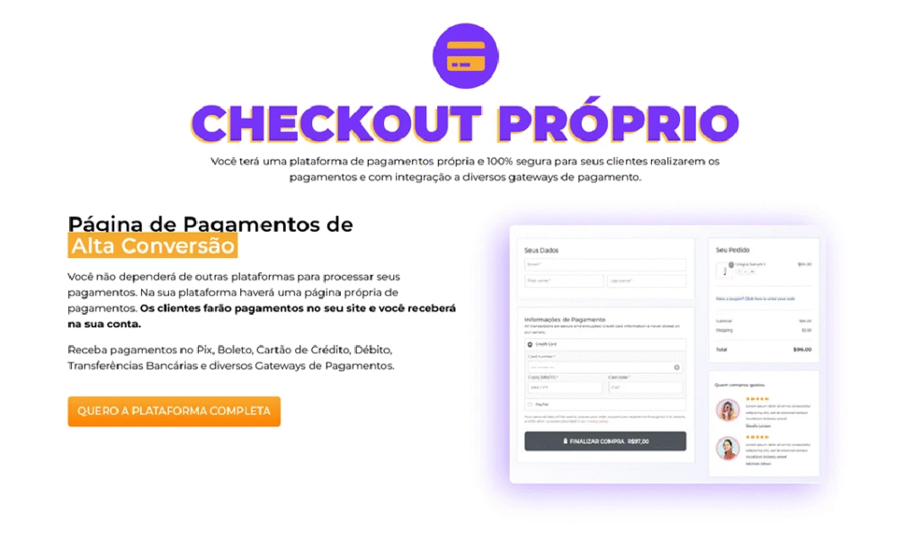
| 7 | OWN CHECKOUT | Screenshot of checkout and reinforcement of lower fees |
| 8 | ORDER BUMPS | Demonstrate upselling in one click |
| 9 | EXCLUSIVE BONUSES | Extra e-book packages and bonus classes |
| 10 | SEE WHAT YOU WILL RECEIVE | Persuasive text + orange CTA |
| 11 | BUY | Combo mockup + final purchase button |
| 12 | QUESTIONS? | FAQ on Purple Accordion with 10+ Questions |
This short and direct flow reduces objections, reinforces benefits and maintains the focus on “buy now”.
Mobile experience and usability
Although Behance only shows desktop screenshots, the layout has been planned mobile first:
- Sections stack vertically with generous spacing.
- Product galleries and FAQs become carousels swipe.
- Orange buttons maintain height ≥ 44 px for comfortable clicks.
- Minimum 16 px text and AA contrast guarantee readability without zooming.
Technical optimization & SEO
| Factor | Implementation |
|---|---|
| Speed | WebP images, lazy loading, critical inline CSS |
| Semantic structure | Single H1, H2 per section, descriptive alt text |
| Keyword density | ≈ 1% in strategic points (title, meta, 1st paragraph, subtitles) |
| Links | External checkout rel="nofollow", internal links to other landing page cases |
| PageSpeed | Average score 90+ (desktop & mobile) |
These good practices favor ranking for terms such as “infoproducts landing page” and “suitable checkout for online courses”.
Results and next steps
In the first 20 days, the page recorded 220 visits and 18 direct sales, reaching 8.1% conversion rate. The module order bumps accounted for 22% of additional revenue, proving the effectiveness of upsells.
Do you want one infoproduct sales page that combines modern design, advanced features and high conversion power? Get in touch and let’s turn your digital catalog into recurring revenue!