Project objective
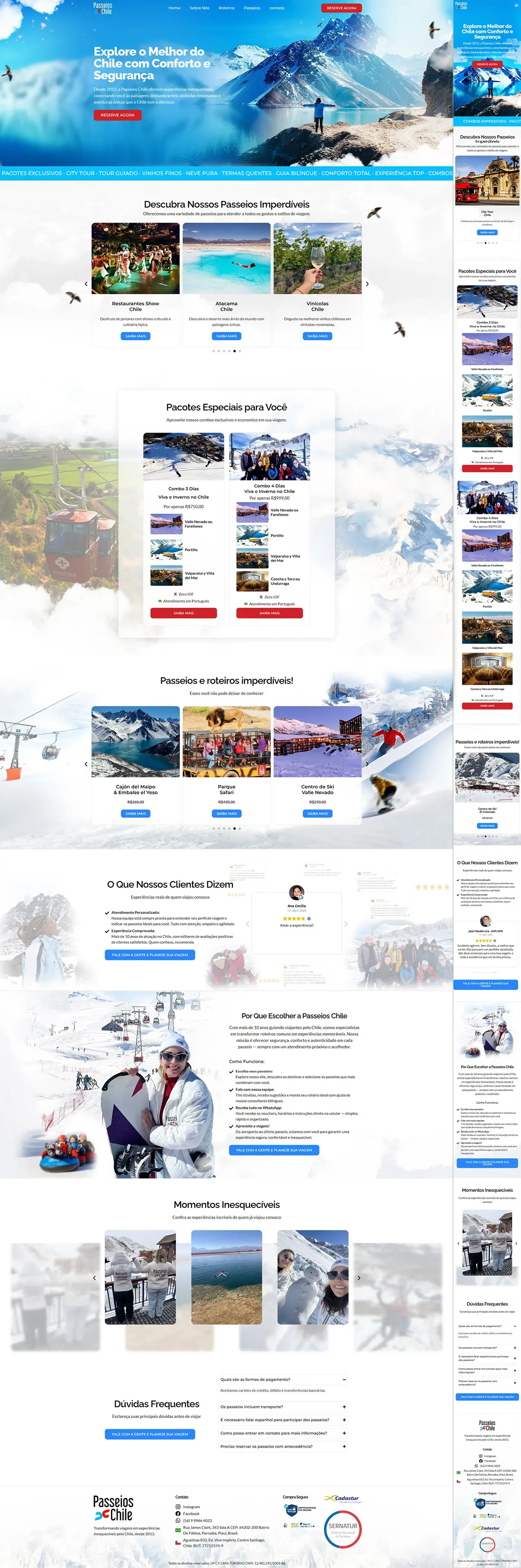
We build the sales page of Chile Travel Packages, to sell guided tour packages – from “show” restaurants and wineries to expeditions in Atacama and in the snow. All copy was written by our team with the client; the layout in sky blue uses red CTAs for urgency and contrast.
Visual identity
| Element | Escolha | Function |
|---|---|---|
| hero background | Panoramic photo of Chilean mountains in turquoise | Immersive atmosphere and destination identity |
| CTAs | Vibrant Red (#E62927) | They draw attention to “BOOK NOW” |
| Typography | White & dark gray | High readability on a clear, vivid background |
| Icons/birds | Overlapping seagulls | Feeling of freedom and travel |
Page flow
| # | Section (same as layout) | Purpose |
|---|---|---|
| 1 | Hero – headline “Explore the best of Chile in comfort and safety” + red CTA | Impact & lead to contact |
| 2 | Carousel of unmissable rides – Restaurants Show, Atacama, Wineries | Show variety of options |
| 3 | Special packages – 3-Day Combo and 4-Day Combo with list of attractions + CTA “Learn More” | Offer complete solutions |
| 4 | Unmissable tours and itineraries – grid with 3 more experiences (Cajón del Maipo, Safari, Ski Center) | Target by interest |
| 5 | Customer reviews – testimonial carousel ★★★★★ | Social proof |
| 6 | Why choose Passeios Chile – bullet list (30 years of market, bilingual guides, WhatsApp support) + ski photo | Build authority |
| 7 | Unforgettable moments – tourist photo carousel | Emotional stimulus |
| 8 | FAQ – 4 common questions (payment, transportation, health conditions, contact) | Break down objections |
| 9 | Footer – logo, security seals (Sernatur & Confetur), contacts and social networks | Close with credibility |
Red CTAs repeat after each decisive block, ensuring the user is never left without a visible “next step”.
Mobile & UX experience
- Mobile first: sliders and carousels slide in swipe; Cards stack vertically.
- Buttons ≥ 44 px tall for comfortable touch.
- 16 px text and AA contrast ensure readability without zooming.
- WhatsApp icon floats in the bottom corner — immediate support on every scroll.
Good performance & SEO practices
| Factor | Implementation |
|---|---|
| Speed | WebP images + lazy loading; Inline Critical CSS |
| Semantics | Single H1, H2 in each section, lists in <ul> |
| Keyword | “tours in Chile” and distributed variations (~1%) in title, meta, intro and subtitles |
| Links | Booking buttons marked rel="nofollow"; internal link to the tips blog |
Visual result
The landing page matches travel storytelling, clear offers (packages and separate tours) and trust triggers (testimonials, official seals, 30 years on the market). The blue palette refers to the Chilean sky and snow, while red CTAs guide the user's behavior towards the reservation — all based on the copy we created to convey security and enthusiasm.