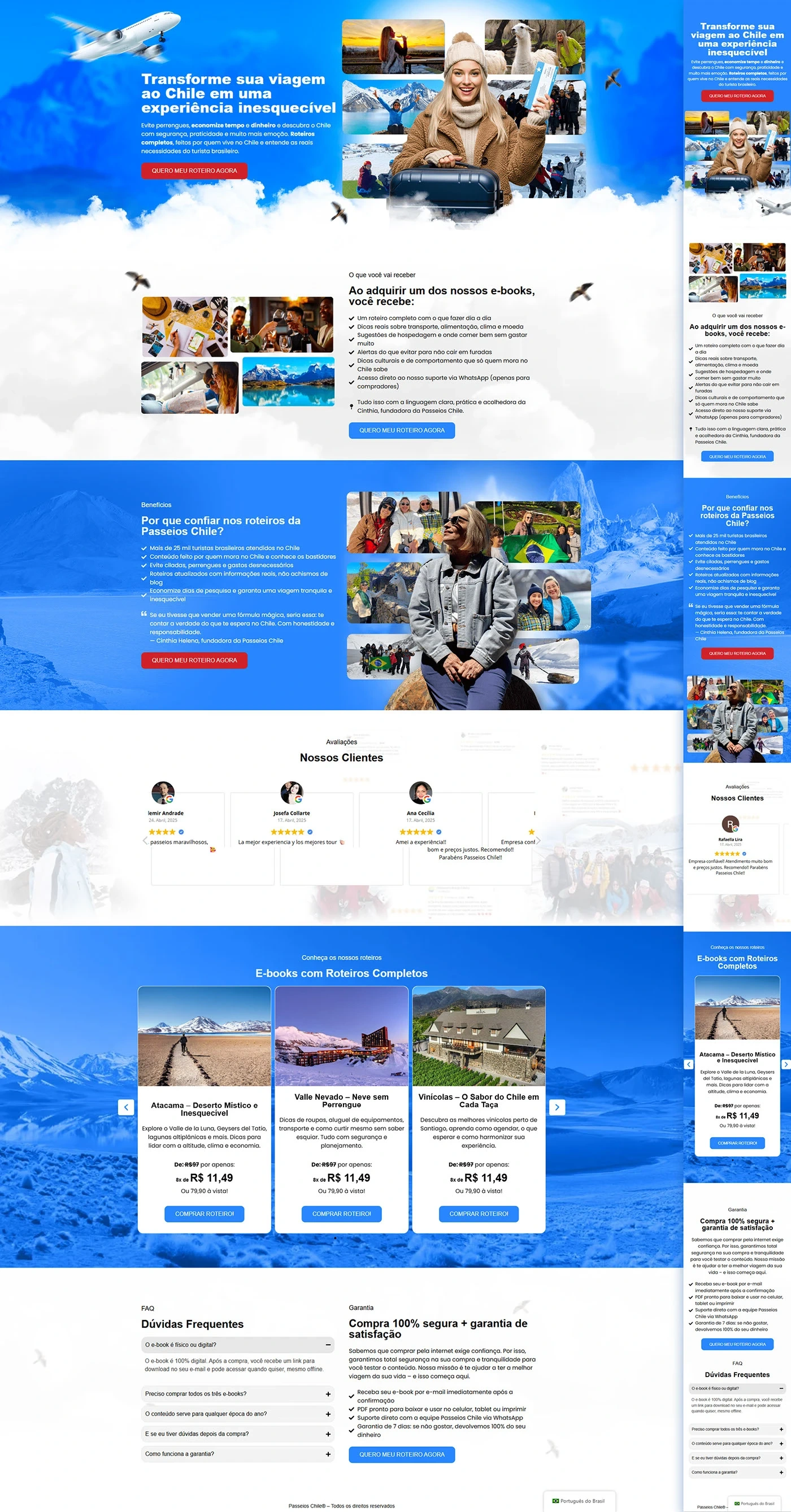
We develop the sales page for Chile Travel Itineraries for the Chile Tours with a completely conversion-oriented architecture. The objective was to highlight, at an affordable price, e-books on the destinations Atacama, Valle Nevado and Wineries. All the copy was created in-house and enhanced by a visual identity in sky blue — the brand's institutional color — contrasted by CTAs in vibrant red, encouraging an immediate purchase decision.
Visual identity
Element
Escolha
Function
Background
Gradient Blue (#0082FF → #0F4DEB)
Refers to the Andean sky/snow; creates visual unity
Primary CTAs
Orange-Red (#E62619)
High contrast: “I WANT MY SCRIPT NOW”
CTAs on cards
Medium Blue (#0062CF)
Maintains cohesion and hierarchy of action
Typography
White & graphite gray
Legibility on a vivid background
Images
Chile photo mosaic (provided)
They humanize, show landscapes and experiences
Landing page structure
Order
Section (layout exact)
Objective
1
Hero – Headline “Turn your trip to Chile into an unforgettable experience”, photo mosaic + red CTA
Initial impact & immediate action
2
What will you receive – checklist (day-to-day itinerary, maps, saving tips, WhatsApp support)
Show tangible value of the ebook
3
Benefits – block “Why trust Passeios Chile itineraries?” + collage of images of the founder
Build authority (20 years of expertise)
4
Reviews – “Our Customers” carousel with 3 testimonials ★★★★★
Social proof
5
Offers – 3 e-book cards (Atacama, Valle Nevado, Wineries) with promotional price R$ 11.49
Convert visitors
6
FAQ – accordion (questions about download, refund, deadline)
Mobile first: carousels slide by swipe; Cards stack vertically.
Buttons ≥ 44 px tall for comfortable clicks.
16 px base typography and AA contrast ensure zoom-free reading.
WhatsApp button floats in the bottom right corner throughout the scroll.
Good practices applied (performance & SEO)
Factor
Implementation
Images
WebP+ lazy loading for fast charging
Semantics
Single H1, H2 in each section, benefit lists in <ul>
Focus keyword
Distributed (~1%) in title, meta, first paragraph and subtitles
Links
Checkout buttons marked rel="nofollow"; internal link to another tourism case
Warranty
Text block + padlock icon to reinforce security
Conclusion of the case
The landing page matches travel storytelling, practical value (guideline, saving tips, support) and trust triggers (testimonials, guarantee, symbolic price). The blue palette reinforces the “Chile” destination, while the red CTAs lead the eye directly to the purchasing action — all in line with the copy developed by our team.
Share:
Shall we work together?
Contact us and receive a quote today. Click the button below and be a success story!