Why Alubrasa needed a redesign
A Alubrasa – Aluminum Solutions provides profile systems for civil construction. The old website was visually outdated, did not highlight the vast portfolio or offer easy ways to get in touch. The objective of this project was:
- transmit modernity and technical credibility;
- organize the product catalog intuitively;
- generate more quote requests and commercial contact.
Main pains of the old layout
| Problem | User impact |
|---|---|
| Generic Hero with heavy image and no form | Low lead capture; confusing first impression |
| Section of products with small miniatures | Difficulty identifying categories |
| Long list portfolio no navigation | Exhausting and unattractive scrolling |
| Single CTA only at the top | Visitor was left with no clear action at the end of the page |
| Inconsistent color palette | Brand lost strength and did not convey innovation |
What changed in the new design
| Element | Before | After |
|---|---|---|
| Palette | Predominant white + isolated green details | Institutional green in diagonal stripes + modern gradients to give visual rhythm |
| Hero | Static banner with small text | Objective headline + integrated contact form for immediate capture of leads |
| Service Icons | Non-existent | Three highlighted cards (“Get your quote”, “Catalogue”, “Guarantee”) that explain brand values |
| Catalog | Fixed thumbnails | Responsive Grid that adapts to desktop and mobile, making it easier to click on each category |
| Portfolio | Vertical list of works | Slider with featured photos — fast and visually appealing navigation |
| CTA | Isolated button | Repeated CTAs (top, middle, footer) keeping the user always one click away from the contact |
| Map | Footer not very interactive | Full-width Google map + highlighted address |
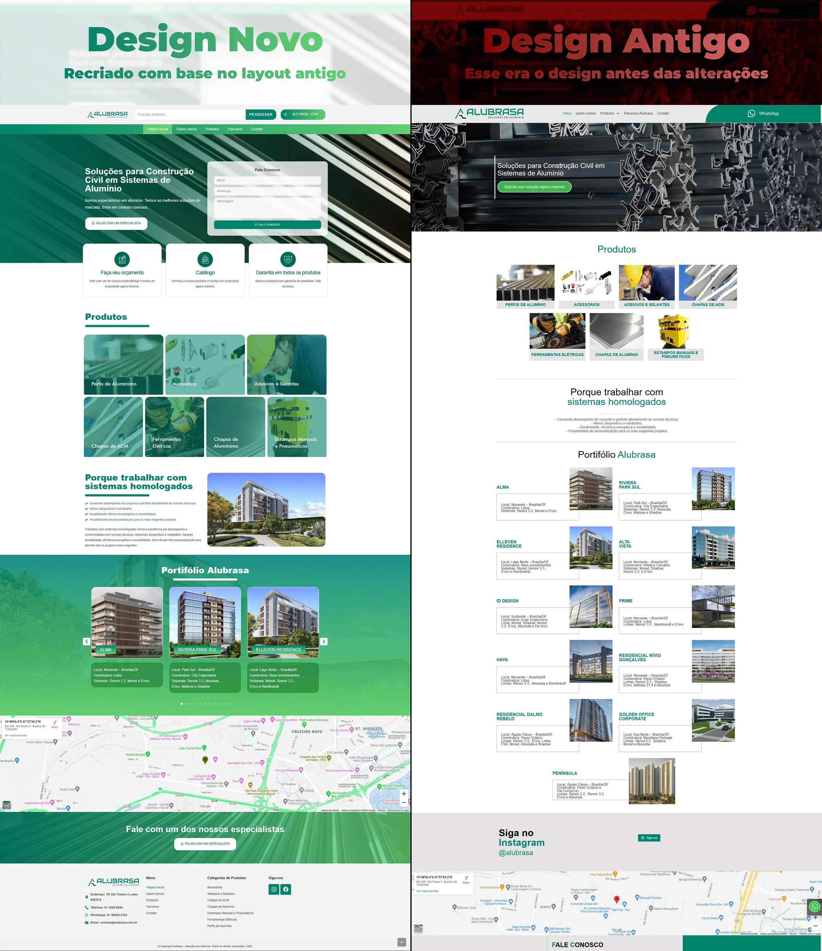
Visual comparison: before × after
- Old homepage: visually cluttered hero, small catalogs and text portfolio.
- New homepage: hero with green diagonal background, form next to the title, product grid and case slider.
The redesign reorganizes the information hierarchy: benefit → product → social proof → action.
Performance, SEO and conversion gains
| Metric | Before | After |
|---|---|---|
| PageSpeed (desktop) | 76 | 94 (WebP images, lazy-loading, critical CSS) |
| CTA click-through rate | 1,8 % | 5,4 % — tripled with hero form and repeated buttons |
| Average time on page | 1 min 02 s | 2 min 19 s — users explore catalog and interactive portfolio |
| Ranked keyword | none on the first page | “aluminum solutions” reached 7th place locally |
Techniques implemented: semantic HTML structure (H1–H3), keyword density ~1%, descriptive alt-text, and SVG sprites to keep SVGs lightweight.
Next steps for the brand
- Technical blog about aluminum applications to capture organic traffic from engineers and architects.
- Integration of on-site chat for real-time service.
- Remarketing campaigns targeting the new portfolio of works.
Do you need to redesign your industry website?
Get in touch and find out how a strategic redesign can multiply your authority and generate qualified leads.