1. Project Overview
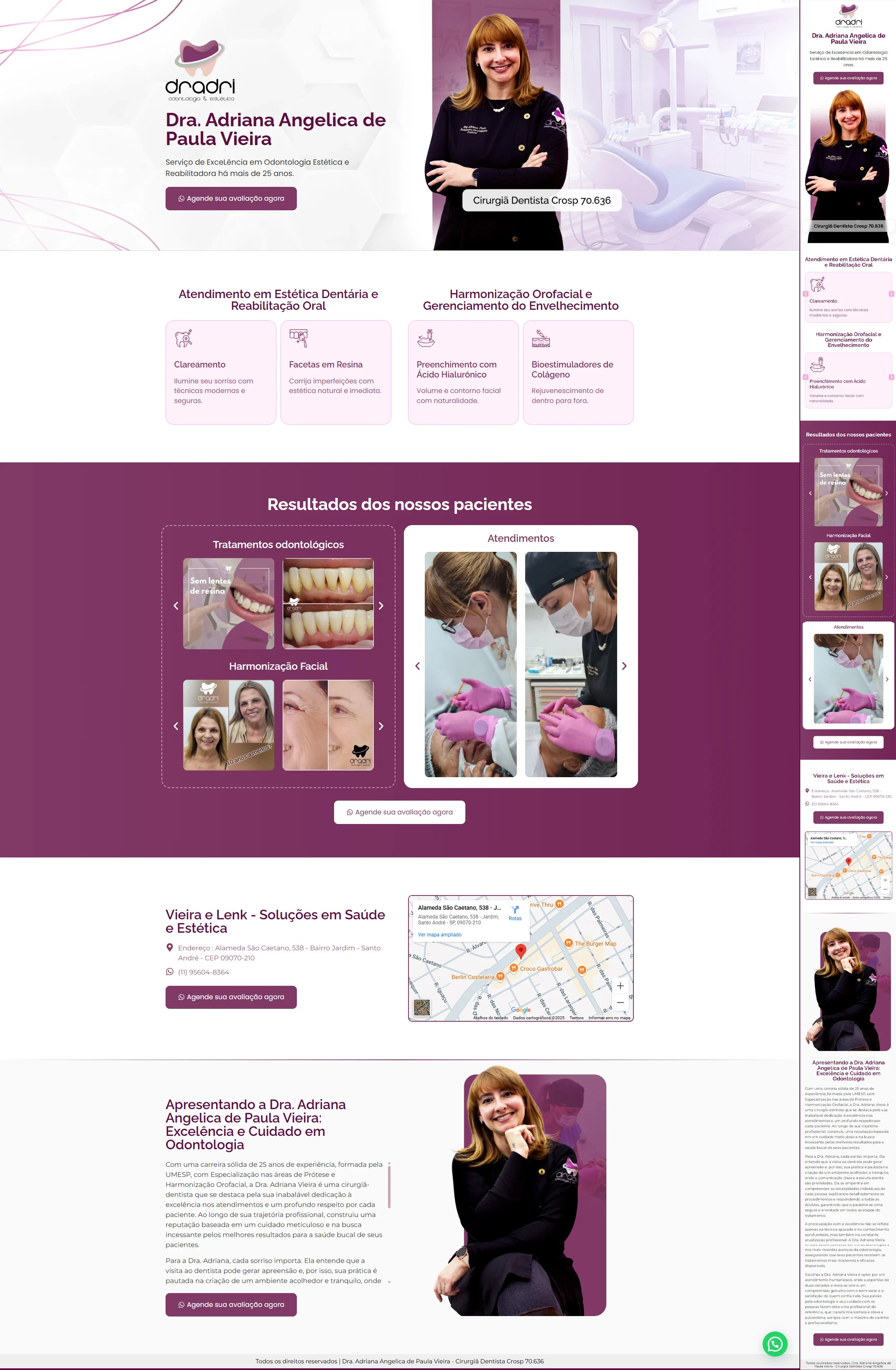
The Dr. Adriana Angelica de Paula Vieira, a dental surgeon with more than 25 years of experience, handed over the full copy and requested that the layout follow the logo colors (purple-violet gradient with light pink details). Our role was to organize the information, enhance the images provided and lead the visitor to the sole objective of the page: schedule an evaluation.
2. Visual identity
| Element | Color/Feature | Function |
|---|---|---|
| hero background | Purple-violet gradient | Elegance and differentiation in dental aesthetics |
| Service cards | Light pink (#F9E6F0) + thin purple border | Create soft contrast and maintain lightness |
| CTA buttons | Dark purple (#57205C) with white text | Immediate highlight – “Schedule your review now” |
| Typography | Graphite gray & white | Maximum readability on light and dark backgrounds |
| Photos | Professional portrait, close-up of smiles, assistance | Humanize and generate trust |
3. Actual landing page structure
| Order | Section (identical to layout) | Objective |
|---|---|---|
| 1 | Hero – full name + specialty + CTA “Schedule your evaluation now” | Initial impact & direct action |
| 2 | Dental Aesthetic Services – 2 cards (Whitening, Resin Facets) | Highlight dental treatments |
| 3 | Orofacial Harmonization – 2 cards (Hyaluronic Acid Filler, Collagen Bio-Stimulators) | Feature facial treatments |
| 4 | Patient outcomes – triple carousel: Dental Treatments, Facial Harmonization, Services | Visual social proof |
| 5 | Location – “Vieira and Lenk – Health and Aesthetics Solutions” block + embedded Google map + CTA | Facilitate in-person visit |
| 6 | Professional presentation – full institutional text + photo in a confident pose | Reinforce authority and empathy |
| 7 | Footer – copyright, CRO, stamps and floating WhatsApp button | Close keeping contact in sight |
4. Mobile experience & usability
- Layout mobile first: Carousels slide with swipe and cards stack vertically.
- CTAs ≥ 44 px tall, well-spaced for comfortable touch.
- 16 px base typography and AA contrast ensure zoom-free reading.
- WhatsApp button remains visible throughout the scroll.
5. Technical optimization and SEO (without result metrics)
| Factor | Implementation |
|---|---|
| Speed | WebP+ Images lazy loading; Inline Critical CSS |
| Semantics | Single H1, H2 for each section, lists and descriptive alt-text |
| Keyword | “aesthetic dentistry landing page” distributed in title, meta, first paragraph and subtitles (~1% density) |
| Links | WhatsApp/Calendar buttons with rel="nofollow"; internal link to another dental case |
6. Final considerations
Even with previously defined copy and photos, the redesign:
- Organized dental and facial services in clear blocks.
- Highlighted visual evidence via segmented carousels.
- Kept brand consistency by exclusively using the purple gradient of the logo.
- Guided the visitor by repeated CTAs until the appointment, without distractions.